Variable Content Width
A sophisticated CSS snippet that makes Obsidian's content area width adaptive, configurable, and responsive to pane splits. Transform your Obsidian experience with intelligent content width management that works seamlessly across all view modes and screen sizes.
Variable Content Width for Obsidian
A sophisticated CSS snippet that makes Obsidian's content area width adaptive, configurable, and responsive to pane splits. Transform your Obsidian experience with intelligent content width management that works seamlessly across all view modes and screen sizes.
Features
Intelligent Width Control
- Container Query Based: Uses modern CSS container queries for true responsive design per pane
- Style Settings Integration: Full GUI control through the Style Settings plugin
- Split-Pane Aware: Automatically adapts to narrow/wide panes in split view
- Readable Line Length Compatible: Works with Obsidian's native toggle
Responsive Design
- Desktop Optimized: Smart width management for screens ≥1024px
- Mobile Friendly: Follows theme defaults on smaller screens
- Container Queries: Tables and diagrams adapt based on pane width
- Print Optimized: Clean layout for PDF export
Typography Excellence
- Heading Hierarchy: H1, H2, H3 with independent width controls
- Callout Styling: Configurable callout width for better balance
- Visual Polish: Centered headings and optimized spacing
- Accessibility: High contrast and reduced motion support
Advanced Customization
- Min/Max Constraints: Set readable width boundaries
- Padding Control: Adjustable side padding in wide mode
- Element Breakout: Tables and diagrams can expand beyond content width
- Real-time Updates: Changes apply instantly via Style Settings
Quick Start
Compatible with
- Style Settings Plugin (for GUI controls)
Installation
For Users
-
Download the CSS file:
- Go to the latest release
- Download
variable-content-width.cssfrom the release assets
-
Install in Obsidian:
- Open Obsidian Settings → Appearance → CSS Snippets
- Click the folder icon to open snippets folder
- Place
variable-content-width.cssin the folder - Refresh the snippets list and enable "Variable Content Width"
-
Configure via Style Settings:
- Install the Style Settings plugin if you haven't already
- Go to Settings → Style Settings → Variable Content Width
- Adjust settings to your preference
For Developers
If you want to modify the source code:
-
Clone the repository:
git clone https://github.com/Bregor/obsidian-variable-content-width.git cd obsidian-variable-content-width -
Install dependencies:
npm install -
Build the CSS:
npm run buildOr watch for changes during development:
npm run watch -
Install in Obsidian:
- Copy the built
variable-content-width.cssto your Obsidian snippets folder - Or create a symlink for automatic updates during development
- Copy the built
Usage
Basic Configuration
The snippet works great with default settings, but you can customize everything:
Main Settings
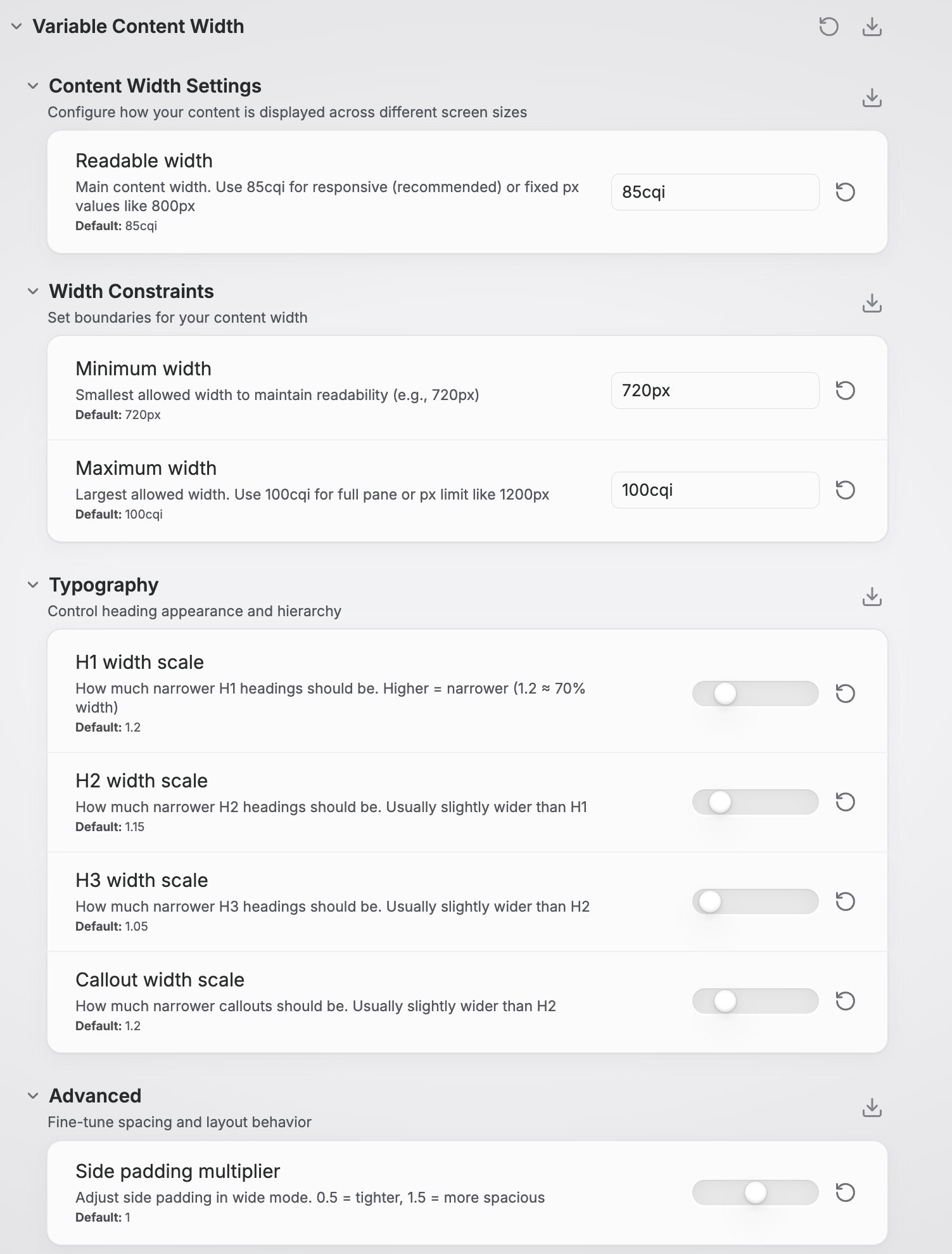
- Readable Width:
85cqi(responsive) or800px(fixed) - Min Width:
720px(readability floor) - Max Width:
100cqi(full pane) or1200px(cap)
Typography Controls
- H1 Scale:
1.2(makes H1 ~70% of content width) - H2 Scale:
1.15(slightly wider than H1) - H3 Scale:
1.05(even wider) - Callout Scale:
1.2(narrow callouts for focus)
Advanced
- Padding Scale:
1.0(adjust side spacing in wide mode)
Understanding Container Units
The snippet uses cqi (container inline size) units for true responsive design:
/* Responsive - adapts to pane width */
--vcw-set-readable-width: 85cqi;

/* Fixed - always the same size */
--vcw-set-readable-width: 800px;
Why cqi is better: In split view, 85cqi means 85% of the pane width, not the entire screen. This ensures optimal readability in both full-width and split layouts.
View Mode Behavior
Readable Line Length: ON
- Content is centered with your configured constraints
- Works in both source and preview modes
- Headings and callouts follow typography hierarchy
Readable Line Length: OFF
- Content uses full pane width with smart side padding
- Tables and diagrams can expand to full width
- Still respects max-width constraints for readability
Advanced Features
Responsive Elements
Elements adapt based on pane width:
/* Medium panes (≥900px): Tables get more room */
@container content-view (min-width: 900px) {
  .markdown-rendered table {
    width: min(100cqi, calc(readable-width * 1.2));
  }
}

/* Large panes (≥1200px): Full-width elements */
@container content-view (min-width: 1200px) {
  .markdown-rendered table {
    width: 100%;
  }
}
Element Breakout
Mark content for special treatment:
- Wide Images:
(alt text contains "wide") - Wide Callouts:
> [!wide]callouts - Tables: Automatically expand on large panes
Print & Export
Optimized for clean PDF exports:
- Removes width constraints for full-page content
- Maintains readability without artificial limitations
- Works with Obsidian's native export features
Technical Details
Theme Compatibility
The Variable Content Width snippet has been tested and verified to work seamlessly with:
Official Themes
- Default - Obsidian's built-in theme
Community Themes
- Retroma - Retro-inspired minimalist theme
- Minimal - Clean, focused writing experience
- Velocity - Modern, fast-loading theme
- Primary - Bold, colorful design system
- Cupertino 2 - macOS-inspired interface
- Fancy-a-Story - Creative writing focused
- Vesnea Vibe - Vibrant, modern aesthetic
Note: The snippet uses Obsidian's core CSS classes and container structure, making it compatible with most well-built community themes. If you encounter issues with a specific theme, please report it so we can investigate compatibility.
Browser Compatibility
- Container Queries: Chrome 105+, Firefox 110+, Safari 16+
- Logical Properties: All modern browsers
- CSS Variables: Universal support
- Graceful Degradation: Older browsers get fixed layouts
Performance
- Efficient Selectors: Minimal DOM traversal
- Hardware Acceleration: Uses
transformwhere beneficial - Memory Footprint: ~45KB built CSS (modular source), no JavaScript
- Calculation Caching: Browser optimizes
calc()expressions
Build System
The snippet uses PostCSS for building from modular source files:
Source Structure (src/):
variable-content-width.css- Main entry pointmodules/_vars.css- CSS variables and Style Settings schemamodules/_containers.css- Container query definitionsmodules/preview.css- Preview mode stylesmodules/source.css- Source/edit mode stylesmodules/mobile.css- Mobile responsive stylesmodules/a11y.css- Accessibility featuresmodules/print.css- Print/export optimizationsmodules/debug.css- Debug mode visuals
PostCSS Pipeline:
postcss-import- Module concatenationpostcss-nesting- Nested selector supportautoprefixer- Browser compatibility
Architecture
Variable Content Width
├── Root Variables (Style Settings controlled)
├── Desktop Layout (≥1024px)
│   ├── Container Definitions
│   ├── Readable Mode (centered content)
│   ├── Wide Mode (padded content)
│   ├── Typography Hierarchy
│   └── Responsive Elements
├── Mobile Layout (≤1023px)
├── Accessibility Features
└── Print Styles
Customization Examples
Academic Writing Setup
:root {
  --vcw-set-readable-width: 70cqi;  /* Narrower for focus */
  --vcw-set-h1-scale: 1.5;          /* Very narrow titles */
  --vcw-set-callout-scale: 1.1;     /* Wider callouts for quotes */
}
Design/Creative Setup
:root {
  --vcw-set-readable-width: 95cqi;  /* Wide for images */
  --vcw-set-padding-scale: 0.5;     /* Minimal padding */
  --vcw-set-max-width: 1400px;      /* High resolution cap */
}
Coding/Technical Setup
:root {
  --vcw-set-readable-width: 90cqi;  /* Wide for code blocks */
  --vcw-set-h1-scale: 1.1;          /* Wide headings */
  --vcw-set-padding-scale: 0.3;     /* Tight spacing */
}
Troubleshooting
Common Issues
Q: Changes don't apply immediately A: Refresh Obsidian or toggle the CSS snippet off/on in Appearance settings.
Q: Source mode content is too narrow A: Ensure "Readable line length" setting matches your preference in Settings → Editor → Display.
Q: Container queries not working A: Update to a recent Obsidian version. Older versions may not support container queries.
Q: Style Settings not showing options A: Make sure the Style Settings plugin is installed and enabled.
Debugging
Enable debug mode by temporarily adding:
.markdown-preview-sizer,
.cm-sizer {
  outline: 1px dashed red !important;
}
This shows content boundaries to help troubleshoot layout issues.
Contributing
Contributions are welcome! Please see CONTRIBUTING.md for detailed guidelines.
Quick Start for Contributors
- Fork this repository
- Clone and install dependencies
git clone https://github.com/YOUR_USERNAME/obsidian-variable-content-width.git cd obsidian-variable-content-width npm install - Create a feature branch (
git checkout -b feature/amazing-feature) - Make changes to source files in
src/ - Build and test (
npm run buildornpm run watch) - Test your changes across different themes and screen sizes
- Commit your changes (
git commit -m 'Add amazing feature') - Push to the branch (
git push origin feature/amazing-feature) - Open a Pull Request
Development Workflow
- Edit source files in
src/modules/ - Run
npm run watchfor automatic rebuilding - Test in Obsidian (create a symlink to your snippets folder for live updates)
- Use debug mode (Style Settings → Variable Content Width → Debug → Enable debug mode)
- Verify changes work across themes and view modes
License
This project is licensed under the MIT License - see the LICENSE file for details.
Acknowledgments
- Obsidian Team for the excellent platform and CSS hooks
- Style Settings Plugin developers for the configuration framework
- Obsidian Community for feedback and testing
- CSS Container Queries specification for enabling true responsive design
Support
- Issues: GitHub Issues
- Discussions: GitHub Discussions
Made with ❤️ for the Obsidian Community
How to Install
- Download the repository ZIP below
- Unzip it and find the CSS snippet file
- Move the CSS file into your vault's
.obsidian/snippets/folder - Open Obsidian → Settings → Appearance → CSS Snippets → Enable it
Stats
Stars
10
Forks
0
License
MIT
Last updated 8mo ago
Categories