SNIPPETBigSpoon33
Datacore_Components_Showcase
CSSAny theme
# Glo* Component Library
A themed, mobile-friendly component library for Obsidian DatacoreJSX.
## Features
- **16 UI Components** - Buttons, toggles, progress bars, cards, inputs, selects, tabs, badges, dials, and more
- **Theme System** - Complete theme management with live preview and editing
- **Mobile-First** - All components optimized for touch with 44px minimum targets
- **Effects** - Glow, lift, press, and rainbow effects
- **Frontmatter Binding** - Components can read/write to note frontmatter
- **Gradient Utilities** - Preset gradients and builder functions
## Components
| Component | Description |
|-----------|-------------|
| **GloButton** | Versatile button with effects, icons, and sprites |
| **GloToggle** | Toggle switch with labels and animations |
| **GloBar** | Progress bar with draggable sprite |
| **GloCard** | Container with header, footer, and variants |
| **GloInput** | Text input with validation and frontmatter binding |
| **GloSelect** | Dropdown with search and multi-select |
| **GloTabs** | Tab navigation with multiple styles |
| **GloBadge** | Status badges and removable tags |
| **GloDial** | Circular dial for time/angle/percentage |
| **ColorPicker** | HSV color picker with presets |
| **GradientBuilder** | Visual gradient editor |
| **BackgroundPicker** | Combined color/gradient/image picker |
| **CalendarPicker** | Date selection widget |
## Quick Start
1. Install the **Datacore** plugin in Obsidian
2. Copy this vault or the `System/Scripts` folder to your vault
3. Open `System/Dashboards/Component-Showcase.md`
## Usage
```javascript
// Import a component
const { GloButton } = await dc.require(
dc.fileLink("System/Scripts/Components/dc-gloButton.jsx")
);
// Use it in your datacorejsx block
<GloButton
label="Click Me"
icon="🎉"
onClick={() => new Notice('Clicked!')}
/>
```
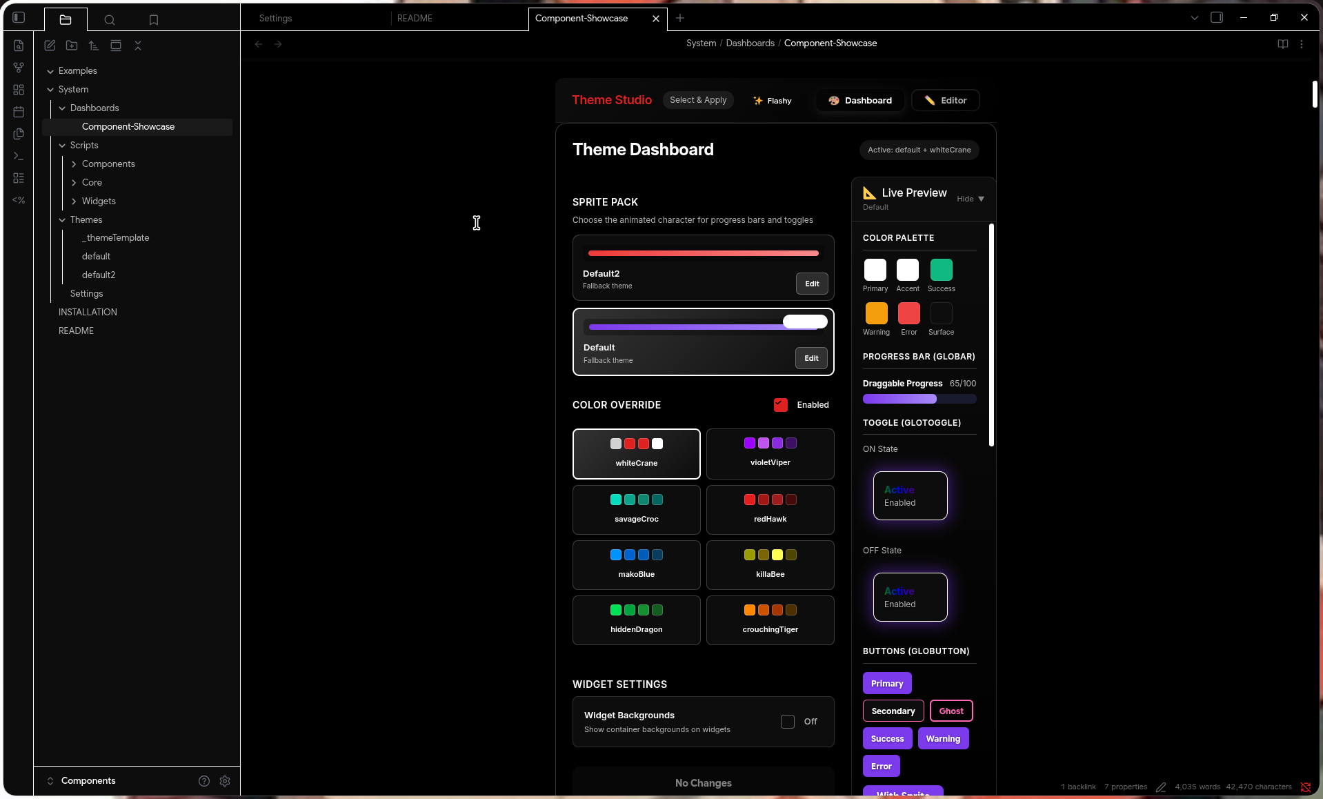
## Theme System
The Theme Studio provides complete theme management:
```javascript
// Include the Theme Studio widget
await dc.require(dc.fileLink("System/Scripts/Widgets/dc-themeStudio.jsx"))
```
or as a codeblock
```markdown
```datacorejsx
const scriptPath = "System/Scripts/Widgets/dc-themeStudio.jsx";
const target = dc.fileLink(scriptPath);
const result = await dc.require(target);
const view = result?.renderedView ?? result?.View ?? result;
const Func = result?.Func ?? null;
return function View() {
const currentFile = dc.useCurrentFile();
if (Func) {
return Func({ currentFile, scriptPath });
}
return view ?? <p>Failed to render</p>;
}
```
Create custom themes with the Theme Studio
## Folder Structure
```
System/
├── Scripts/
│ ├── Core/ # Theme provider and utilities
│ ├── Components/ # All UI components
│ └── Widgets/ # Theme Studio and dashboard widgets
├── Themes/ # Theme files and templates
└── Dashboards/ # Component showcase
```
## Requirements
- Obsidian v1.0+
- Datacore plugin
- Minimal Theme by Kepano
- Minimal Theme Settings
- Style Settings
## Showcase
### Default Themes
#### Theme Studio

---
#### Bars

---
#### Toggles

---
#### Buttons

---
#### Selects

---
#### Inputs

---
#### Cards

---
#### Dials

---
#### Badges

---
#### Tabs

---
#### Gradients

---
#### Vertical Bars

---
### Flashy Themes (DIY)
#### Bars

---
#### Toggles

---
#### Buttons

---
#### Selects and Inputs

---
#### Switching Themes

## Credits
Created by Rice AF (more like Potato AF)
How to Install
- Download the CSS file below
- Move it to your vault's
.obsidian/snippets/folder - Open Obsidian → Settings → Appearance → CSS Snippets → Enable it
Stats
Stars
11
Forks
0
License
MIT
Last updated 2mo ago
Categories