obsidian-dashboard
obsidian-dashboard
A dense, masonry-style dashboard layout for Obsidian — built from plain headings and bullet lists.
No plugins. No Dataview. No HTML in your notes. One CSS snippet turns an ordinary Markdown outline into a colour-coded control panel.
Why
Most Obsidian dashboards are built one of two ways: a wall of nested bullets that wastes 70% of the
window, or a plugin-driven grid that locks your content into a query language. dashboard takes a
third route — it reads a plain Markdown outline and lays it out as a flowing masonry of cards.
Your note stays portable. Delete the snippet and you still have a perfectly readable list.
---
cssclasses:
  - dashboard
---
## Workshop
- **Projects**
	- [[Kayak build]]
	- [[Clock repair]]
- **Stock**
	- [[Hardwood inventory]]
## Heading becomes a section — a pill-shaped title above a bordered card.
Each top-level bullet becomes a block inside the card. Nested bullets are the links.
Features
| Masonry flow | Sections stream through a multi-column layout instead of stacking in rigid rows. A short section slides up beside a tall one, so there are no dead zones on the right. |
| Colour-coded sections | Each section gets its own hue, applied to the border, surface, hover state and title pill from a single variable. |
| Tuned for density | Every spacing value is a variable on a single block at the top of the file. Defaults are tight without shrinking the text — the type stays at your vault's reading size. |
| Zero-chrome reading view | The inline title and properties block are hidden in Reading view only — the editor keeps them, so frontmatter stays editable. |
| Marked exits | Links that leave the vault are marked ↗. Note links carry nothing: staying inside is the default, and a default needs no glyph. Underlines are removed throughout. |
| No bullet noise | List markers are suppressed at every level; a small square in the section colour marks each block instead. |
| Code as payload | Inline `code` is tightened into a tinted chip, so an ID or a token reads as data rather than as an aside. |
| Seamless borders | The outline is drawn by a single element, so no sub-pixel gap can open up inside it (see How it works). |
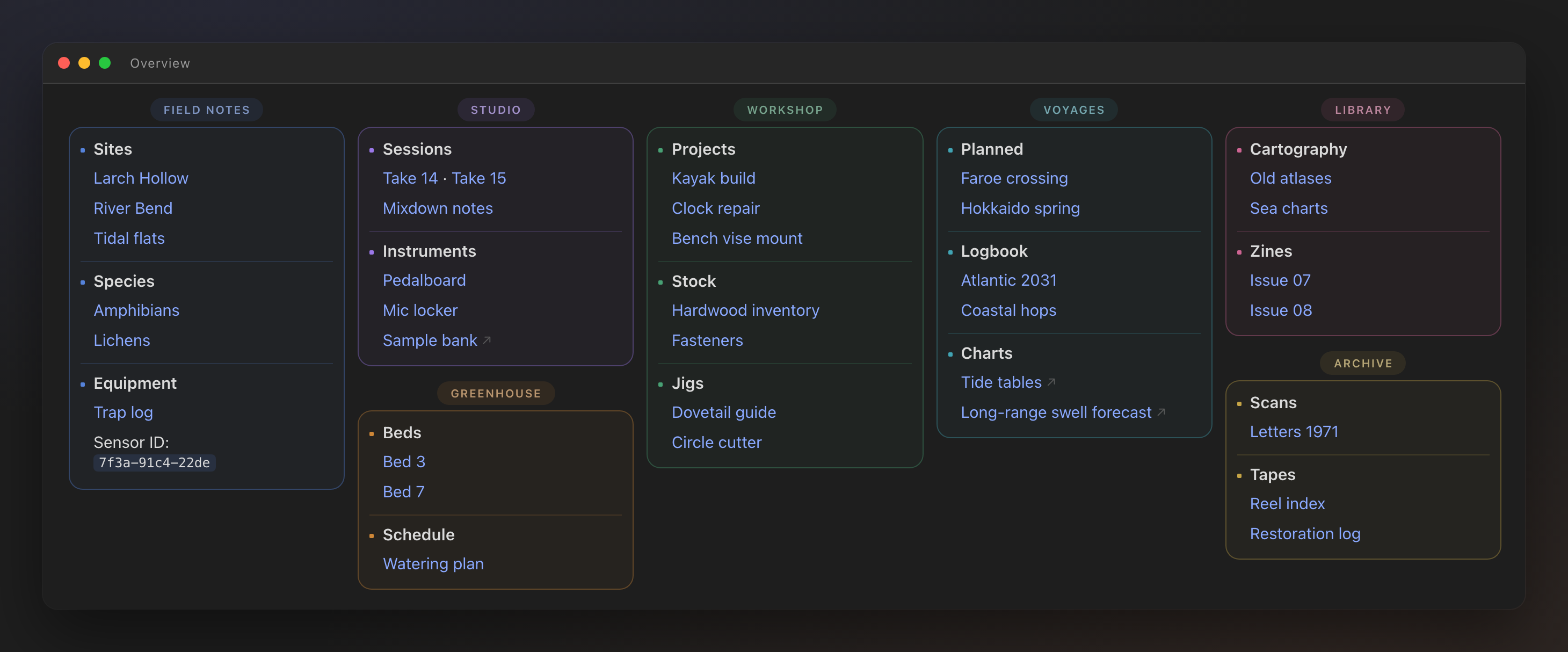
Preview
| 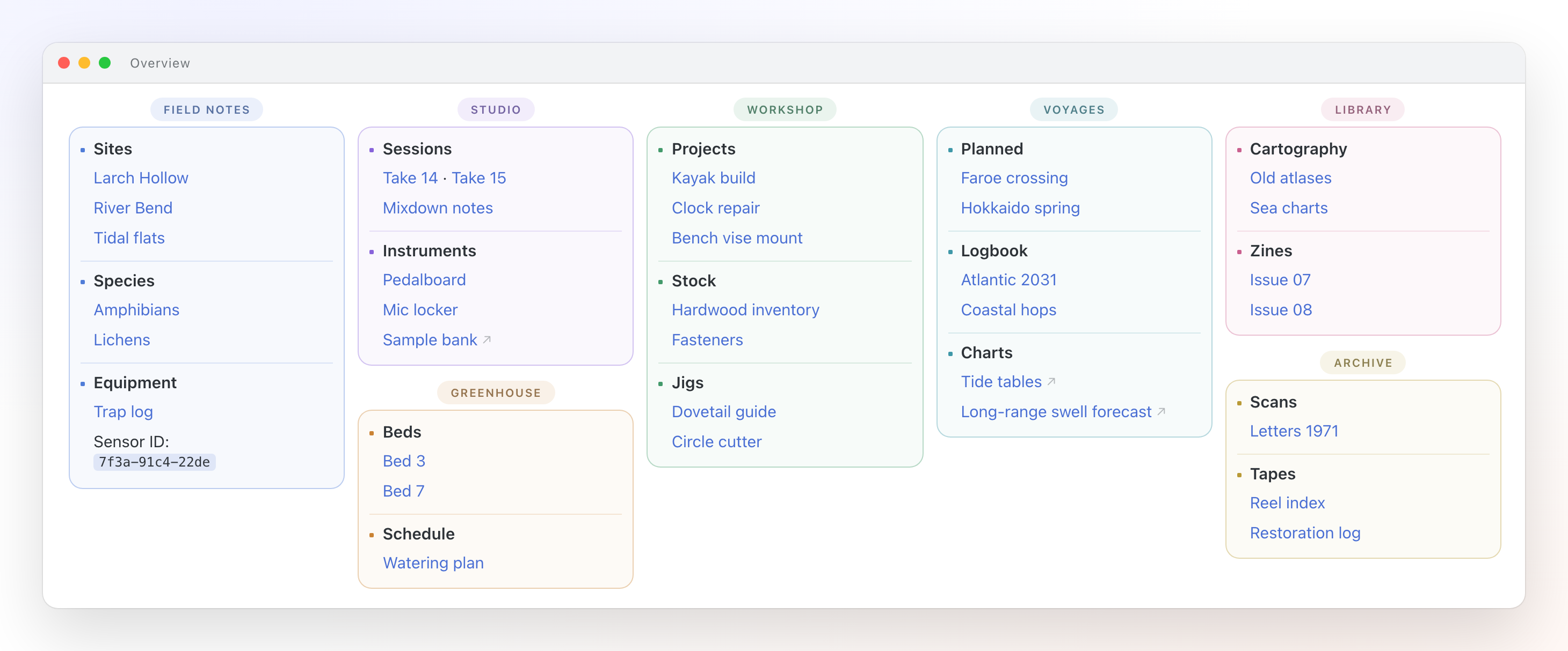 |
| Dark | Light |
All colours derive from your theme's variables, so the snippet follows whatever theme and accent colour you already use.
Install
- Copy
dashboard.cssintoYourVault/.obsidian/snippets/ - Enable it in Settings → Appearance → CSS snippets
- Add the class to any note's frontmatter:
---
cssclasses:
  - dashboard
---
- Open the note in Reading view (
Cmd/Ctrl + E)
[!IMPORTANT] The layout only applies in Reading view. Set Settings → Editor → Default view for new tabs to Reading view, or pin the note, so it always opens laid out.
Writing the note
The structure is deliberately boring — three levels, nothing else:
## Section title          ← a bordered card, title rendered as a pill
- **Block title**         ← a group inside the card
	- [[A note]]          ← content, indented with a Tab
	- [External link](https://example.com)
	- [[One]] · [[Two]]   ← use · to put short links on one line
	- Token: `abc-123`    ← inline code renders as a compact chip
A few rules worth knowing:
- Indent with tabs, not spaces. Obsidian's default is tabs; spaces produce a different DOM and the nesting styles will not match.
- Mobile falls back to one column. Below 600px the layout drops to a single column — two narrow columns are cramped on a phone and misalign at column breaks.
- Section order controls packing. Sections flow in document order and, by default, are never
split across columns — so a tall section followed by another tall one can leave a gap. Put short
sections next to each other and the columns fill evenly. If you would rather have the columns fill
completely and accept cards that continue in the next column, set
--dash-split: auto. - Long rows wrap, they do not break apart. A row that is too long for the column continues on
the next line at the same left edge. It still reads as one entry because the leading inside a row
is deliberately tighter than the gap between rows — see
--dash-lhand--dash-link-ybelow.
Customisation
Everything tunable lives in one block at the top of the file.
Layout
| Variable | Default | What it does |
|---|---|---|
--dash-col | 228px | Minimum column width; the column count adapts to the window. |
--dash-gap | 12px | Gap between columns. |
--dash-card-gap | 13px | Gap below a card, before the next section title. |
--dash-radius | 13px | Card corner radius. |
--dash-split | avoid | avoid keeps every card whole. auto lets a tall card continue in the next column, filling the columns completely at the price of split cards. |
--dash-scale | 1 | Type scale relative to your vault font. Density comes from the spacing values, not from shrinking text. |
Spacing
| Variable | Default | What it does |
|---|---|---|
--dash-head | 28px | Height of the title strip above each card. |
--dash-head-gap | 5px | Gap between that strip and its card. |
--dash-pad-y / --dash-pad-x | 9px / 10px | Card inner padding. |
--dash-row-y | 8px | Padding above and below a block. The visible gap between two blocks is twice this. |
--dash-lh | 1.2 | Leading inside one row — the gap you see when a row wraps. |
--dash-link-y | 5px | Padding that holds one row away from the next row. |
--dash-title-gap | 4px | Gap between a block title and its first link. |
--dash-marker / --dash-marker-gap | 4px / 8px | Square marker before a block title, and the gap after it. Block content is indented by marker + gap. |
--dash-pad-top-mobile | 49px | Top padding on mobile, added to the device safe area. Raise it if the app header still overlaps. |
[!TIP]
--dash-lhand--dash-link-ywork as a pair, and what makes a wrapped line read as part of its own row is the ratio between them, not their size. Keep the row gap near 1.5× the leading. To tighten a card, pull both down together — shrinking only--dash-link-ymakes wrapped lines start looking like separate entries.
Colour
| Variable | Default | What it does |
|---|---|---|
--dash-accent | var(--text-accent) | Base section colour, overridden per section below. |
--dash-line | 32% of accent | Card border. |
--dash-line-strong | 58% of accent | Card border on hover. |
--dash-line-soft | 16% of accent | Divider between blocks. |
--dash-surface | 4% of accent | Card fill. |
--dash-surface-hover | 10% of accent | Card fill on hover. |
--dash-pill | 10% of accent | Title pill background. |
--dash-pill-hover | 18% of accent | Title pill background while its card is hovered. |
--dash-chip | 13% of accent | Inline code background and link hover. |
--dash-label | 45% accent + muted | Title pill text. |
Section colours
Colours are assigned by position. A section is two sibling elements — the heading and the list — so they are addressed in pairs:
.dashboard .markdown-preview-section > div:nth-of-type(2),
.dashboard .markdown-preview-section > div:nth-of-type(3) {
	--dash-accent: var(--color-blue);
}
Ten pairs ship by default (blue, purple, orange, green, cyan, pink, yellow, red, then blue and
purple again). Add more by continuing the sequence — (22), (23), (24), (25) and so on. A section
with no matching rule falls back to the theme accent, so nothing breaks if you run out.
Want it monochrome? Delete those rules and set --dash-accent: var(--text-muted) once.
How it works
Five problems had to be solved to make plain Markdown behave like a dashboard. Each has a comment in the source explaining it — the summary:
Masonry from headings. The whole preview is one CSS multi-column context. Sections are kept
whole with break-inside: avoid, and a heading is glued to its list with break-after: avoid on
the element that contains it. The browser balances the columns, so vertical space fills itself.
A section outline with no seams. A heading and its list are two sibling <div>s — you cannot
wrap them in a shared container. Splitting a border between them, top half on one and bottom half on
the other, looks right in theory, but browsers round each box independently and a hairline gap opens
where the two meet. The fix is to stop splitting it: only the list is outlined, and the title sits
above the card instead of inside it. One element, one border, no seam.
Grouping wrapped lines without indenting them. When a row wraps, the runover has to read as part of that row rather than as the next entry. A hanging indent does this, but it breaks the one clean vertical edge a card has. Proximity does it without touching alignment: the leading inside a row is set tighter than the padding between rows, so the eye groups the lines correctly and the left edge stays flush.
Alignment that survives edits. The block title is offset by its marker, so the nested links are
indented by calc(var(--dash-marker) + var(--dash-marker-gap)) — the same numbers. Resize the
marker and the alignment follows automatically.
Optical centring of the pill. letter-spacing adds its gap after every letter, including the
last, so a tracked-out label sits half a gap left of centre inside its own box. The correction is
text-indent: calc(var(--dash-track) / 2) — half the tracking, not all of it. Shifting by the
full amount is a common reflex and simply moves the label off-centre the other way.
Requirements
- Obsidian 1.4+ — needs
:has()support in the bundled Electron - Chromium 111+ for
color-mix()(Obsidian 1.5+ ships this)
Tested with the Border theme; the snippet neutralises that theme's coloured heading indicator and red bold text inside dashboards only.
[!NOTE] Border also sets
text-indent: 9pxon every heading to clear room for that indicator, through a selector specific enough to outrank a plain.dashboard h2rule. The snippet's owntext-indenttherefore carries!important— without it the title sits 9px right of centre in its pill, reserving space for a bar the snippet has already hidden. If you use a different theme and the label looks off-centre, check for a headingtext-indentin it first.
Regenerating the previews
The screenshots are rendered from preview/preview.html, which reproduces
Obsidian's Reading-view DOM with fictional data — no vault contents are exposed.
CHROME="/Applications/Google Chrome.app/Contents/MacOS/Google Chrome"

"$CHROME" --headless --disable-gpu --hide-scrollbars \
  --force-device-scale-factor=2 --window-size=1460,607 \
  --screenshot=preview/dashboard-dark.png \
  "file://$PWD/preview/preview.html"

"$CHROME" --headless --disable-gpu --hide-scrollbars \
  --force-device-scale-factor=2 --window-size=1460,607 \
  --screenshot=preview/dashboard-light.png \
  "file://$PWD/preview/preview.html#light"
No Chrome installed? npx playwright install chromium gives the same engine Obsidian runs.
The 607 is the exact rendered height of .frame at 1460px wide — measure it again if you edit the
demo content, or the shot will end with a band of bare background.
[!WARNING] Each command above launches a fresh browser, which is what makes the
#lighthash work: the page reads it once, on load. If you script both shots in a single session, navigating frompreview.htmltopreview.html#lightis a same-document navigation — the script never re-runs and you get two identical dark screenshots. Setdocument.body.classNamedirectly instead.
License
How to Install
- Download the dashboard markdown file from GitHub
- Drop it into your vault (anywhere)
- Install the Homepage plugin and point it at the file
- Enable any listed CSS snippets for the intended look
Stats
Stars
0
Forks
0
License
MIT
Last updated 1mo ago
Categories