CSS snippets for obsidian
Personal collection of obsidian snippets. These are written with the dark variant of the minimal theme in mind but most should work on both light and dark variants of the vanilla obsidian theme. Some might need modifications to be useful, some might be a bit too topical, but there might be something of use to you here. Feel free to browse!
[!TIP] Snippets have badges for various features or requirements.
for being experimental,
for exposing
cssclasses,for providing Obsidian Style Settings Plugin configuration options, and
for depending on a plugin or theme.
- Installing
- Components
- Typography
- Images
- Credits
Installing
You can find detailed CSS snippet installation instructions at Obsidian's help page
Components
Link callout / Card
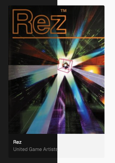
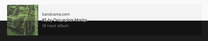
Styles an obsidian callout component as a vertical (link) or horizontal (hlink) card component using the existing callout syntax. Gracefully degrades if unstyled.
Here's how it works, best used in templates because of the finicky syntax. All parts are required:
> [!link] ignored <!-- title ignored, hlink produces horizontal link callout rather than vertical/card callout -->
> [Example Title w/ link](https://example.com/xxx) <!-- title, can be just text but also link -->
>
> ![[S8288469ecf534a62b5462ae9ef47bf5dK.webp]] <!-- cover image, can also be in the standard markdown inline image link format -->
>
> [example.com](https://example.com/xxx) <!-- link, can be also be an empty link: []() -->
>
> A very nice description <!-- description, can be skipped by using a not-printable character like <wbr> -->
This is how the vertical link callout in the screenshot above is produced:
# frontmatter, see cssclasses below
cssclasses:
  - callout-link-ratio-3-4
  - callout-link-max-w-20
> [!link]
> Rez
>
> ![[Gamedb/_resources/Rez-co720j.jpg]]
>
> []()
>
> United Game Artists<wbr>
And this is how the horizontal link is produced:
> [!hlink] #2, by Οτομπρίτσι Μοτόρι
> #2, by Οτομπρίτσι Μοτόρι
>
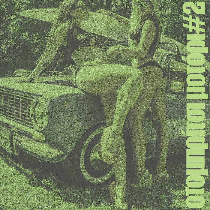
> 
>
> [bandcamp.com](https://otompritsisuperdeluxe.bandcamp.com/album/2)
>
> 18 track album
cssclasses
callout-link-image-containwill useobject-fit: contain;for cover imagescallout-link-max-w-20will set the max width for the default variant to20remcallout-link-ratio-3-4will set the cover image aspect ratio to 3/4. When combined withcallout-link-max-w-20works well with tall and narrow cover images like movie posterscallout-link-cover-image-background-whitewill force cover image background color to whitecallout-link-cover-image-background-blackwill force cover image background color to black
Settings
| id | default |
|---|---|
callout-link-max-width-default | 30rem |
callout-link-min-width | 20rem |
callout-link-max-height-horizontal | 8rem |
callout-link-background | rgb(18 18 18) (dark), rgba(0, 0, 0, 0.024) (light) |
callout-link-link-color | rgb(125 125 125) (dark), rgb(104, 104, 104) (light) |
callout-link-link-hover-color | rgb(145 145 145) (dark), rgb(84, 84, 84) light |
callout-link-title-color | rgb(241 241 241) (dark), rgb(35, 35, 35) light |
callout-link-desc-color | rgb(125 125 125) (dark), rgb(104, 104, 104) light |
callout-link-cover-image-background | rgb(0, 0, 0) (dark), rgb(255, 255, 255) light |
kbd styling
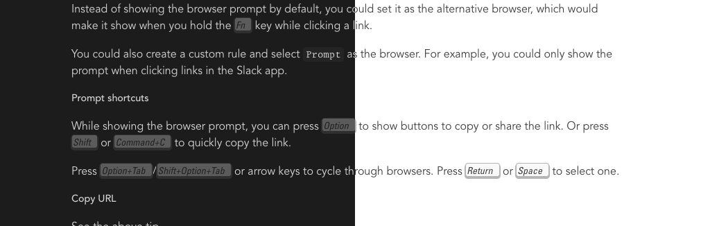
Styling for the <kbd> elements and hotkey display.
Apple extended keyboard kbd styling
kbd.css's sibling, uses the Univers typeface in italic to match the style of the Apple extended keyboard keycap style. Falls back to --font-text if Univers is not available.
Highlight styling
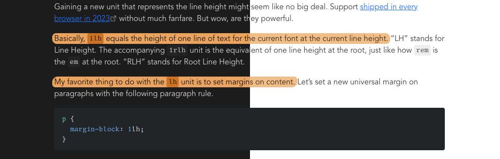
Custom highlight styling, uses pseudo-random border radii and box-decoration-break: clone.
Settings
| id | default |
|---|---|
highlight-background | hsla(33.26, 80%, 65.69%, 1) (dark), hsla(33.26, 80%, 75.69%, 1) (light) |
highlight-box-shadow-offset | 2px |
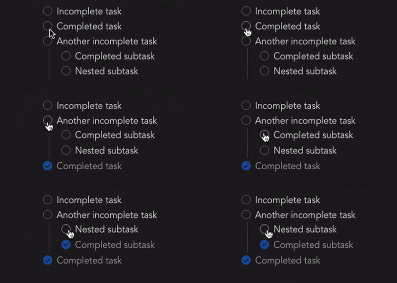
Completed task opacity
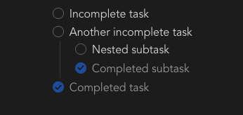
Used to dim completed tasks. Will dim all nested subtasks and bullet points.
Settings
| id | default |
|---|---|
completed-task-opacity | 0.7 |
Move completed tasks to bottom
(Visually) moves completed tasks to the bottom of their list regardless of source order. Works only in reading view.
<ruby> styling
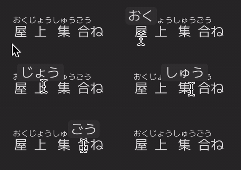
Styling for the ruby element. Depends on this fork of obsidian-markdown-furigana for the hover effect.
Typography
text-wrap value for headings
Text wrapping to use for headings in rendered markdown. Works only in reading view. Defaults to balance
Settings
| id | default |
|---|---|
rendered-markdown-heading-text-wrap | balance |
text-wrap value for paragraphs
Text wrapping to use for paragraphs in rendered markdown. Works only in reading view. Defaults to pretty
Settings
| id | default |
|---|---|
rendered-markdown-paragraph-text-wrap | pretty |
1lh paragraph spacing
Monospace font feature settings
monospace-font-feature-settings.css
Feature settings used for monospace fonts in places like code blocks and frontmatter. See MDN for syntax.
Settings
| id | default |
|---|---|
monospace-font-feature-settings | "ss02" |
Muted URL text in markdown source

Uses minimal theme's --text-formatting value and falls back to Obsidian's --text-faint value.
Source Mode Editor Font
Font to use exclusively for the source mode in the editing view.
Settings
| id | default |
|---|---|
source-mode-editor-font | var(--font-monospace) |
Disable the default subpixel antialiasing (MacOS only)
webkit-font-smoothing-antialiased.css
Makes fonts appear visually lighter by applying -webkit-font-smoothing: antialiased to the document body. More about this in this blog post.
italicized comments for code blocks
Pretty specific hack for italicized code comments for the shiki plugin using the github dark theme.
text-box-trim
text-box-trim-experimental.css
Experimental use of text-box-trim, check text-box-trim-examples for examples. Not recommended for general use.
Images
Force 16/4 image ratio
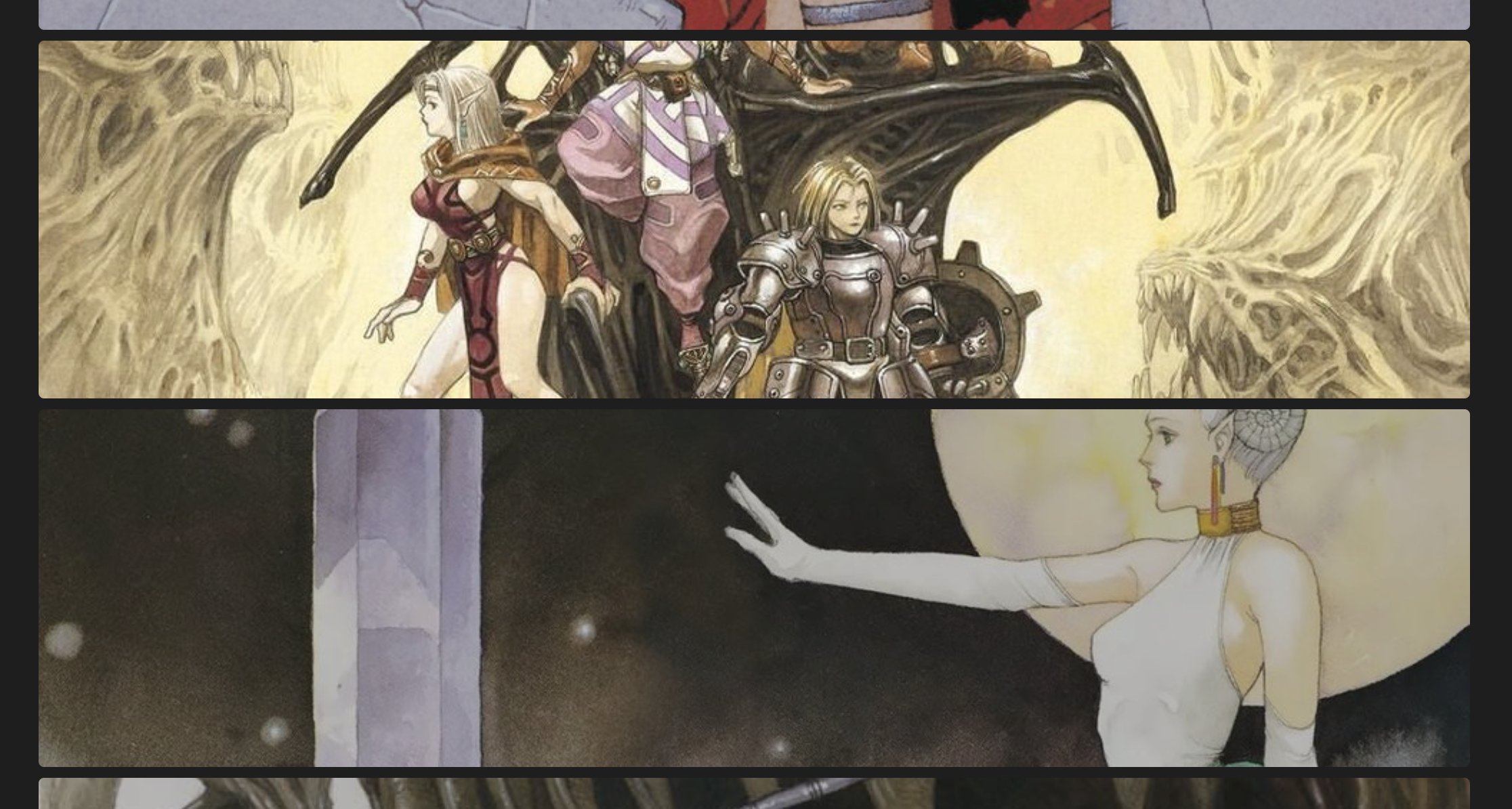
Forces an ultra-wide 16/4 ratio for all note images when adding img-ratio-16-4 to cssclasses. Works only in reading view.
Force 100% image width
Forces a 100% width for all note images that have not a width defined already (ex. ![[img.png|256]]) when adding img-width-100 to cssclasses. Works only in reading view.
No image grid column gaps
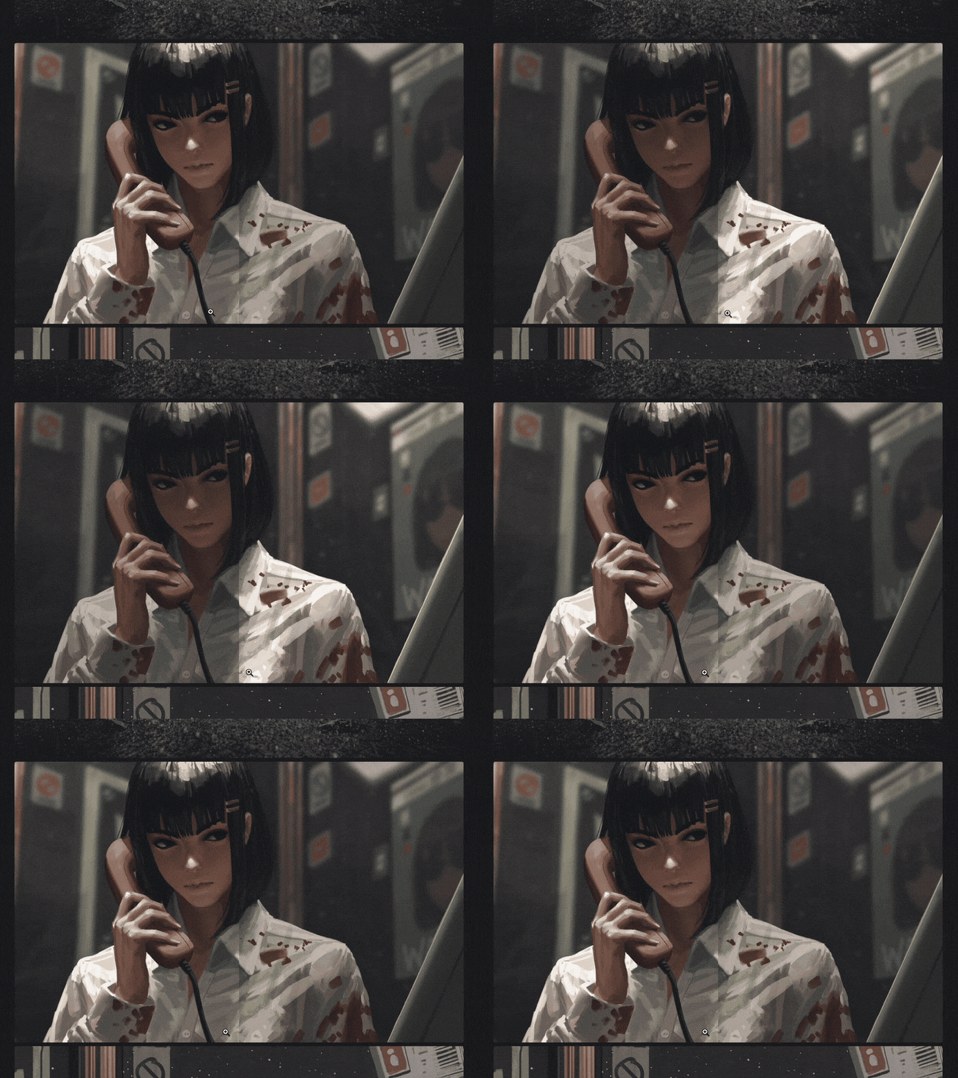
Eliminates column gaps in minimal theme image grids. Useful for things like magazine spreads or continuous images.
Usable by adding img-grid-gap-0 to the cssclasses frontmatter prop.
Auto image rendering
Sets image-rendering to auto by default for both editing and reading views.
Pixelated image rendering
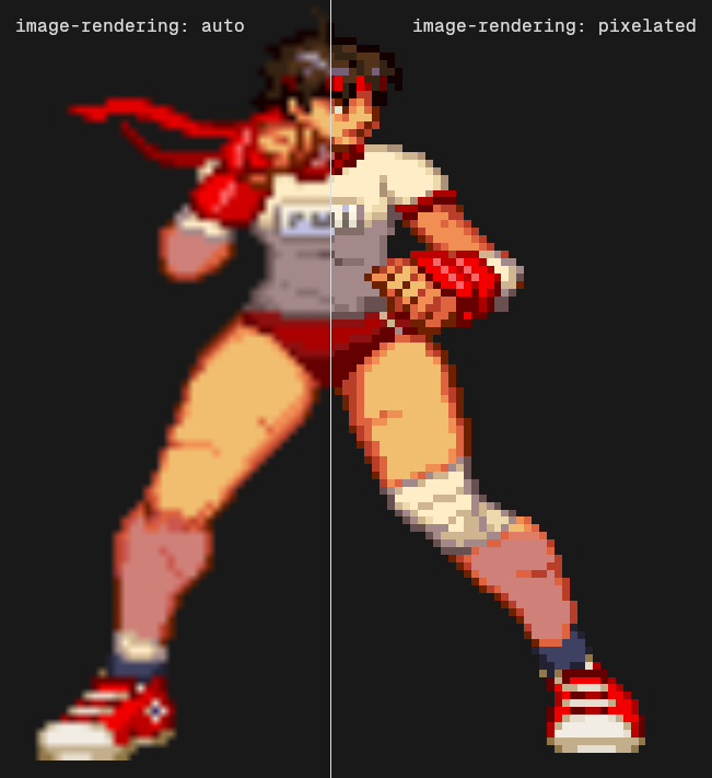
Sets image-rendering to pixelated for note images. Useful for scaled pixel art.
Usable by adding img-rendering-pixelated to the cssclasses frontmatter prop.
Credits
kbdelement styling based on Dylan Smith's Styling the kbd element- Used Kacper Kula's Randomness in CSS with trigonometry functions for producing randomness in CSS
- Badges generated with shields.io
How to Install
- Download the repository ZIP below
- Unzip it and find the CSS snippet file
- Move the CSS file into your vault's
.obsidian/snippets/folder - Open Obsidian → Settings → Appearance → CSS Snippets → Enable it
Stats
Stars
3
Forks
0
Last updated 3mo ago